Your home office is more than just a room where you park your laptop. It is the command center of your professional life, a space where you need to feel focused, creative, and comfortable. If you find yourself staring at bland, uninspiring walls during conference calls, it might be time for a change.
For residents of Morris Plains, NJ, creating a workspace that works for you starts with the right color palette. The interior painting experts at Gemstar Contractors have compiled this comprehensive guide to help you select the perfect hues to boost productivity and style.
Psychology of Color: Why It Matters for Remote Work
Before choosing a swatch, it is helpful to understand why color impacts your workflow. Color psychology suggests that the shades surrounding us can influence our mood, energy levels, and cognitive function.
In a home office setting, the stakes are high. The wrong color can lead to eye strain or agitation, while the right one can help you enter a “flow state” faster. Whether you are crunching numbers, writing code, or designing graphics, your environment should facilitate your specific type of work.
Top 5 Trending Colors for Home Offices
Here is a look at the most effective color choices for modern workspaces, ranging from energizing bolds to calming neutrals.
1. Soft Olive Green: The New Leader
Biophilic design meets softer, more livable tones with soft olive green. It’s calming, natural, and quietly confident.
-
- The Vibe: Calm, natural, quietly confident.
- Why It’s Trending: Combines the restorative benefits of nature with a softer saturation that’s easier to live with than emerald. Perfect for NJ’s ever-changing seasonal light.
- Best For: Professionals with long workdays, stress reduction, and creating Zoom-friendly backgrounds.
- Styling Tip: Pair with warm woods or brass accents for a timeless, earthy look. Use it as a soft statement wall or go all-in for a cohesive, calming workspace.
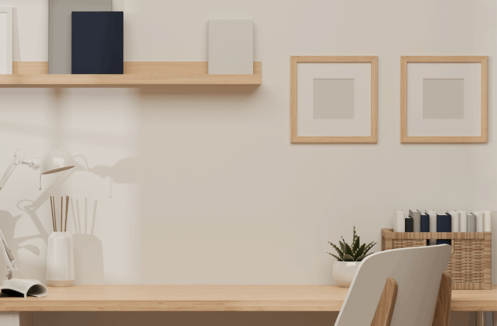
2. Warm Greige: The Golden Beige Evolution
Say goodbye to stark white offices and hello to warm greige—a professional and flexible neutral tone that flatters any space.
-
- The Vibe: Professional, flexible, flattering.
- Why It’s Trending: A modern, updated neutral that works beautifully in both contemporary and traditional homes.
- Best For: Small offices or client-facing professionals who need a polished yet inviting space.
- Styling Tip: This shade complements virtually any decor style. Pair it with natural textures or metallic touches for added dimension.
3. Muted Clay / Soft Terracotta: Cozy Creativity
Muted clay, or soft terracotta, brings warmth and comfort without overwhelming the senses—a perfect choice for creatives.
-
- The Vibe: Grounded, creative, comforting.
- Why It’s Trending: Adds warmth without visual fatigue, making it an ideal choice for winter-heavy regions like New Jersey.
- Best For: Writers, designers, and creatives seeking an inspiring yet cozy workspace.
- Styling Tip: Pair muted clay with creamy whites or olive greens for a modern, organic palette that feels fresh year-round.
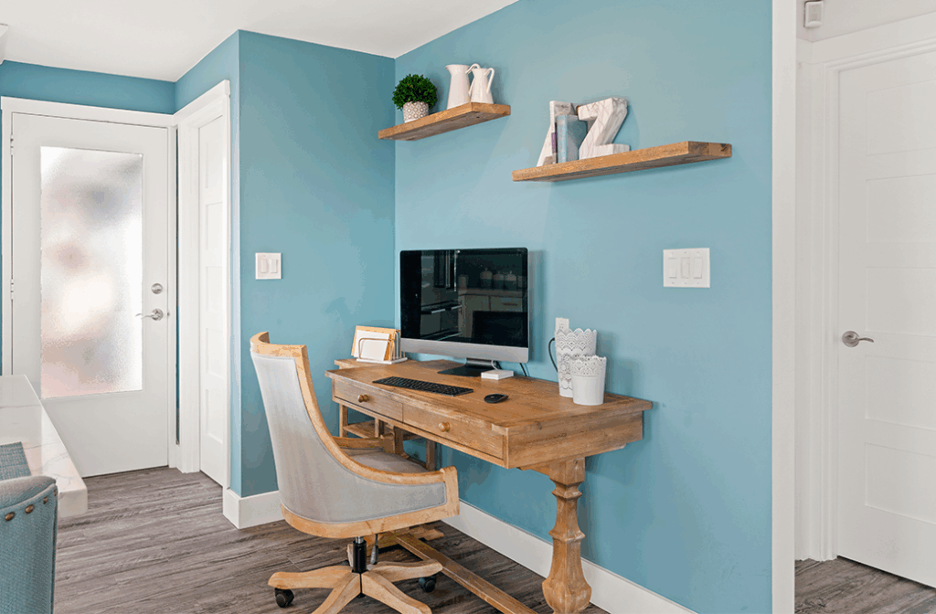
4. Blue-Gray or Blue-Green Mist: Modern Calm
This sophisticated evolution of powder blue offers a clean, modern tone with a calming influence, perfect for focus-driven work.
-
- The Vibe: Focused, clean, modern calm.
- Why It’s Trending: A fresher, more current take on blue that feels less cold and more refined.
- Best For: Analytical thinkers, shared office spaces, or anyone who needs a clean, mentally refreshing environment.
- Styling Tip: Pair it with crisp white trim or natural wood finishes for a coastal or minimalist look.
5. Soft Charcoal or Deep Taupe: Elevated Sophistication
Dark tones remain popular, but the trend is shifting toward softer, warmer shades like soft charcoal or deep taupe.
-
- The Vibe: Elevated, intentional, modern.
- Why It’s Trending: Balances the dramatic appeal of dark colors with mental wellness in mind. Perfect for creating a high-end, grounded feel.
- Best For: Accent walls, executive offices, or tech-heavy setups where screen glare is a concern.
- Styling Tip: Use with warm lighting and metallic accents to enhance the room’s elegance without feeling too heavy.
Selecting the Right Paint Finish for Functionality
Color is the aesthetic choice, but the finish (sheen) is the functional choice. In a home office, you need to balance durability with light reflection.
-
- Matte/Flat: Absorbs light and hides imperfections in the drywall. However, it can be difficult to clean if you scuff the walls with your chair.
- Eggshell: The most popular choice for home offices. It has a slight luster that adds depth to the color but is still low-sheen enough to prevent harsh glare from your monitor.
- Satin: Highly durable and easy to wipe down. This is ideal for high-traffic areas or if your office doubles as a playroom or guest room.
| Pro Recommendation: For most homes, our painting team at Gemstar recommends an eggshell finish. It offers the perfect middle ground—sophisticated looking, yet washable.
Lighting and Local Climate Factors
When choosing interior paint, you must account for the local light. The direction your office windows face changes how the paint color appears on your walls.
-
- North-Facing Rooms: The light is cooler and bluish. A cool gray paint might look icy here. Counteract this with warmer tones like Golden Beige or Terracotta.
- South-Facing Rooms: These rooms get intense, warm light. You can get away with cooler colors like Powder Blue or Charcoal Gray, which will balance the warmth of the sun.
- Seasonal Shifts: In the Northeast, winter daylight is scarce. If you are painting a room that relies heavily on artificial lighting during the winter, test your paint swatches under your desk lamps (LEDs), not just in natural sunlight.
Maximizing Your Square Footage
Your paint choice changes the perceived size of the room.
-
- Expanding Small Spaces: If your office is a converted closet or a small spare bedroom, lighter colors like off-whites, light blues, and soft beiges recede visually, pushing the walls back and making the room feel larger.
- Grounding Large Spaces: If you are working in a large, open space that feels too echoing or empty, darker colors like Emerald Green or Charcoal help “bring the walls in,” making the space feel cozier and more purposeful.
How to Choose the Best Paint Colors for a Home Office
Your environment dictates your output. If you are ready to trade your dull walls for a space that inspires creativity and focus, it is time to call in the professionals.
Gemstar Painting specializes in high-quality interior painting for Northern, NJ, and the surrounding areas. We understand the nuances of lighting, finishes, and color selection to help you build the ultimate home office.
Don’t settle for a workspace that drains your energy. Contact Gemstar Painting today for a consultation and let’s make your office as ambitious as you are.
