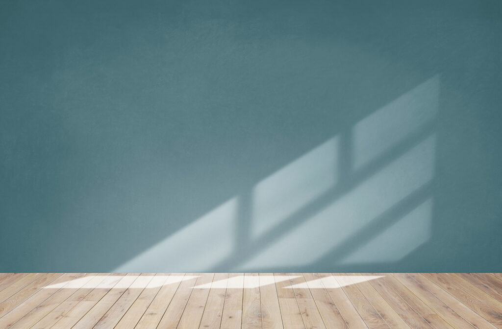
Have you ever walked into a room that felt instantly expansive and airy, even though the square footage was modest? Conversely, have you entered a space that felt intimate and cozy, wrapping you in warmth the moment you crossed the threshold? The secret often isn’t just the architecture or the lighting fixtures. Rather, it’s a little-known metric called Light Reflectance Value, or LRV.
For many homeowners in Northern New Jersey, choosing a paint color is often a matter of holding a swatch against a wall and hoping for the best. But understanding LRV can change the way you see color entirely. It’s the hidden factor that determines how light bounces around your room, affecting everything from the perceived size of the space to the mood it evokes.
At Gemstar Painting Contractors, we believe that painting is about more than just applying a coat of color; it’s about crafting an atmosphere. Whether you are looking to open up a cramped hallway in Morristown or create a moody, sophisticated dining room in Chatham, mastering LRV is the key to unlocking your home’s potential.
What Is LRV (Light Reflectance Value)?
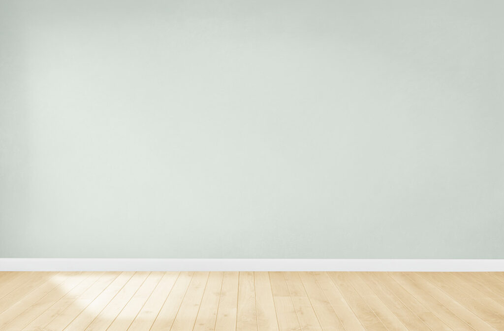
Light Reflectance Value (LRV) is a measurement that tells you exactly how much light a color reflects and how much it absorbs. It is measured on a scale from 0 to 100.
-
- High LRV (closer to 100): These colors are highly reflective. Pure white, for example, has an LRV of 100. It bounces the vast majority of light back into the room.
- Low LRV (closer to 0): These colors are absorptive. Absolute black has an LRV of 0, meaning it absorbs all light that hits it.
While you won’t find many paints that hit the absolute extremes of 0 or 100, understanding where a color sits on this scale is fundamental. A color with an LRV of 85 will feel drastically different on your walls than a similar hue with an LRV of 40. This value dictates the energy of the room: high LRV generally equates to “bright and open,” while low LRV leans toward “cozy and enclosed.”
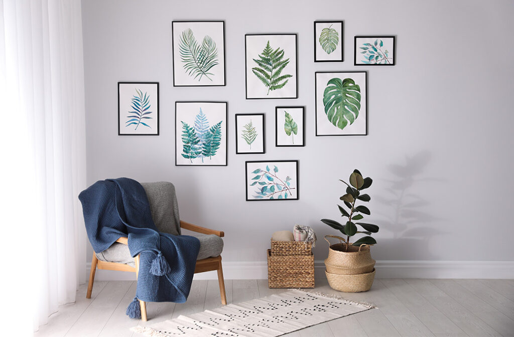
High LRV Colors: Making Rooms Feel Larger and Brighter
If you are dealing with a room that feels small, cramped, or simply lacks natural light, high-LRV colors are your best design tool. Shades with an LRV of 60 or higher act like mirrors for light. When sunlight or artificial light hits these walls, it doesn’t just stop there; it bounces off the surface and illuminates other parts of the room.
This reflection creates a powerful visual illusion. The boundaries of the room seem to recede, blurring the corners and making the ceiling feel higher. This is why interior designers almost universally recommend light colors for tight spaces.
Best Uses for High-LRV Colors
-
- Small Rooms: High LRV colors prevent small bedrooms or home offices from feeling like a box.
- Hallways and Stairwells: These transitional spaces often lack windows. A high-LRV paint helps carry light from adjoining rooms into these darker areas.
- North-Facing Rooms: In the Northern Hemisphere, north-facing rooms receive cool, indirect light that can make a space feel dreary. A warm, high-LRV color can counteract this by maximizing every bit of available light.
- Homes with Limited Natural Light: If your home is shaded by trees or neighboring buildings, high-LRV walls help amplify whatever light manages to get in.
Popular High-LRV Examples: Think soft whites, pale grays, light creams, and gentle pastels. These shades keep the atmosphere airy and fresh.
Low LRV Colors: Creating Warmth and Coziness
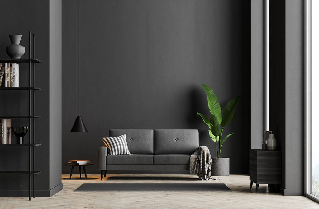
On the other end of the spectrum, we have low-LRV colors. It is a common misconception that dark colors should be avoided because they make a room feel “small.” While it is true that they absorb light, this absorption creates depth, intimacy, and drama—qualities that are highly desirable in specific settings.
Low-LRV colors don’t bounce light around; they hold it. This pulls the walls in visually, which can make a cavernous room feel more grounded or a standard room feel like a sophisticated retreat.
Best Uses for Low-LRV Colors
-
- Bedrooms: A darker, moodier room can signal to the brain that it is time to wind down, promoting better sleep.
- Dining Rooms: Deep navies, charcoal grays, or forest greens can create an elegant, formal backdrop for dinner parties.
- Accent Walls: If you are afraid to commit to a whole room, a low-LRV accent wall adds a focal point without overwhelming the space.
- Media Rooms: Darker walls reduce screen glare and create a theater-like experience.
The key with low-LRV colors is intention. You aren’t trying to make the room look big; you are trying to make it feel rich and enveloping.
Choosing the Right LRV Based on Room Function
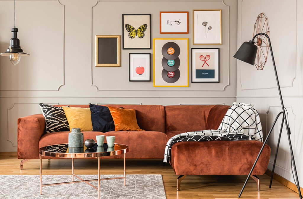
Selecting the right LRV isn’t just about aesthetics; it’s about function. How do you use the room? At Gemstar Painting Contractors, we help homeowners balance their personal style with the practical lighting needs of their space.
Small vs. Large Rooms
In a sprawling open-concept living area, a high-LRV color keeps the flow airy and connected. In a dedicated study or library, a lower LRV creates a sense of separation and focus.
High-Traffic vs. Relaxing Spaces
High-traffic areas like kitchens and mudrooms often benefit from higher LRV colors, which feel energetic and clean. Relaxing spaces, like a den or reading nook, are perfect candidates for mid-to-low LRV tones that encourage settling in.
Daylight Exposure
Take note of where the sun sits. South-facing rooms get intense sunlight; a very high LRV color here might be blindingly bright. A mid-tone might be more comfortable. Conversely, that north-facing room needs all the help it can get from a high-LRV shade.
LRV, Paint Finish, and Lighting: How They Work Together
LRV doesn’t work in a vacuum. It interacts with the sheen of the paint and the lighting in your home.
Role of Sheen
The glossier the finish, the more light it reflects, regardless of color.
-
- Flat/Matte: Absorbs more light, softening the color.
- Eggshell/Satin: Offers a balanced reflection.
- Semi-Gloss/High-Gloss: Highly reflective. A low-LRV color in a high-gloss finish can actually reflect quite a bit of light, creating a glamorous, lacquered look.
Artificial Lighting
Your light bulbs matter. Warm white bulbs (2700K) will pull out the yellow undertones in high-LRV creams, making them feel cozy. Cool white bulbs (4000K+) will make high-LRV grays feel crisp, but potentially clinical. Always test your colors with the lights on and off.
Common LRV Mistakes Homeowners Make
Even with the best intentions, it is easy to misjudge how a color will perform once it is on four walls. Here are a few pitfalls we see often:
-
- Choosing solely from a swatch: A tiny chip can’t show you how a color interacts with light on a large scale. An LRV of 50 might look dark on a chip but surprisingly bright on a wall.
- Ignoring lighting direction: Putting a cool, low-LRV gray in a north-facing room can make the space feel ice-cold and uninviting.
- Using low-LRV colors in dark rooms without contrast: If you paint a dungeon-like basement in dark brown without adding adequate lighting or contrasting trim, it will feel oppressive.
- Overlooking trim and ceilings: Painting your ceiling a high-LRV bright white is the easiest way to lift the room, yet many people forget this “fifth wall.”
Professional Tips from Gemstar Painting Contractors
With over 30 years of experience serving Madison, Chatham, and Morristown, we have learned a few tricks of the trade regarding LRV.
-
- Read the Fan Deck: Most professional paint fan decks list the LRV on the back of the color strip. Use this number as your guide, not just your eyes.
- Leverage Contrast: If you love a low-LRV wall color, pair it with high-LRV bright white trim. This crisp contrast makes the wall color pop and keeps the room from feeling heavy.
- Prep is Important: Light reflection relies on a smooth surface. Professional prep (sanding, patching, and priming) ensures that the light bounces evenly. Bumps and imperfections cast tiny shadows that can dull the overall effect.
- Invest in Quality: Premium paints, like Benjamin Moore Regal Select, offer richer pigments and better coverage. This depth of color ensures that the LRV performs exactly as intended, rather than looking washed out or muddy.
How Paint Color LRV Impacts Light, Space, and Room Size
Your home’s atmosphere is shaped by light, and paint is the filter through which that light passes. By understanding Light Reflectance Value, you stop guessing and start designing. You can strategically use high-LRV colors to expand a small powder room or employ low-LRV shades to wrap your primary bedroom in comfort.
Remember, LRV is a tool, not a rule. It exists to help you achieve the feeling you want, whether that is bright and energetic or dark and moody.
Not sure which paint colors will brighten your home or create the right mood? Contact Gemstar Painting Contractors of Northern New Jersey for professional color guidance and professional interior painting services.
